Horizontal/Linear tabs at the top of a browser were for many users not enough anymore (at least for me, my wife, Andy and Aza). In times when we used browsers with no tabs we had to find other ways for keeping all task related URL’s together since the windows toolbar could become cluttered in minutes and other opened applications soon became lost between all browser’s windows. Then the general public was introduced to tabbed browsing with Firefox. To be precise, Firefox was not the first browser with tabs but it was one of the things that helped its popularity. It even forced IE 7 to introduce tabs as well even if its developers were asserting us that tabs are no future at the beginning of the development process.
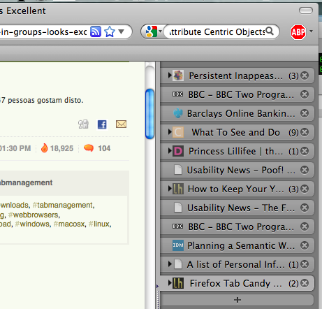
 With computer screens expanding horizontally instead of vertically I wanted to get some use of this space. I found a nice extension called Tree style tab which lets me organize my tabs on the right side of my browser window. I got some more space vertically and I have currently cca. 30 tabs opened and I still haven’t used half of my vertical browser edge (although only 12 are visible while the rest are nested). It also helps me being reminded of stuff I need to do or want to read (something like a lot of people do when they sent email reminders to themselves or leave unread emails of others as reminders of unfinished things).
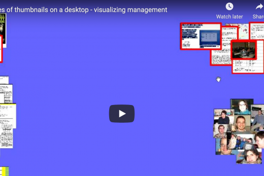
The new Firefox’s Tab Candy also addresses the problem of linear tabs. The main idea behind it is to spatially manage thumbnails of opened URL’s and group/open/close them by tasks (which I’m already doing although not with thumbnails). But it also extends the tab management beyond simply moving tabs around with several other (not yet implemented) ideas:
- grouping tabs and create metagroups of groups which can be zoomed in and out and piled up (the idea of computer piles is old)
- searching for text in all tabs of all groups (very similar to what I tried to do with a desktop search)
- automatic groping (surprise me because I don’t believe in it :))
- a default to-do group of tabs with reminders
- understanding semantics (size, content …) of opened tabs (and groups) to help users find relevant information (prices, facts, images …)
- tabs/groups sharing with friends and other people
- task specific visualizations (something Andy Cockburn did with his Mona email client and visualization of email threads) like showing the links between tabs on how they were opened from each other (also Andy’s WebView)
- personalize groups to help spatial memory with colours and decorations
A word on spatial management and zooming interface. Spatial positioning was long known to be a good aid for memorizing where certain things are on a surface and Tab Candy uses it well; to be honest – spatial management and zooming in and out was his father’s idea behind Archy desktop. And zooming interface was developed way before with Pad++. So a lot of ideas behind Tab Candy are old but are also well suited here (and so underused in mainstream software).
An Introduction to Firefox’s Tab Candy from Aza Raskin on Vimeo.
The only thing that bothers me is the button that needs to be clicked to access tab management spatial area (or pressing Ctrl+Space keys). As Raskin puts it: out of sight, out of mind. I like all my groups visible all the time that serve as reminders. But this can also distract me from doing what I should be doing as it provides far much information than I need while working on a particular task. And to manage tabs in such way with thumbnails a space reserved on the left of my browser is not enough. Maybe shading groups that are not in use would help.


No Responses