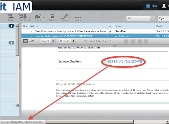
I have come across debates on the web against the URLs showing up in the browser’s left bottom corner if one hovers the mouse over a link. I advocate against hiding the URLs (except in some occasions such as in this guy’s giving a presentation) for security reasons. See the below example:

This is an email with an invoice from supposedly NetSuite. But hovering over the link in the email the URL in the left corner reveals that it is not from netsuite.com but rather from saav.fr.
Maybe it looks ugly, maybe a lot of people don’t care, maybe a lot of them don’t want it. But don’t take it away from power users please (as MS took away the status bar in Windows Explorer). I often want to see where the link I’m trying to click on will take me.
I also want to keep the browser’s address bar! Am I a lonesome cowboy with such view?
