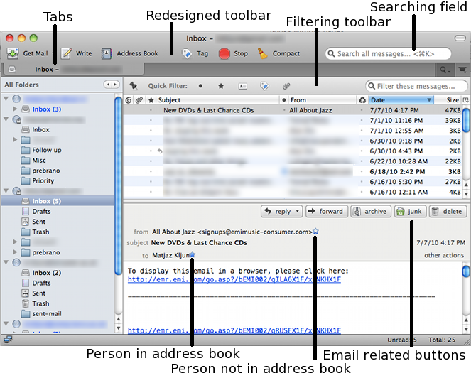
Last week I decided to upgrade my Thunderbird 3.0.3 to 3.1. It keeps positively surprising me every time I do an upgrade with its interface enhancements. I wanted to write about its search facility which was introduced with the version 3 but I never got to it since I wanted to film its usage. Maybe one day. Nonetheless its indexing copes with 5 email accounts over IMAP and 20.000+ messages. It’s amazing! Actually I changed my management from filing email to piling. But more on this issue in one of the future entries.
Main interface changes and features I like in TB3 are:
- indexing and search in real time with a time scale helps me find even 10 years old emails (I have not idea and control of what I have in 30 folders or so) in seconds
- emails can be now opened in tabs which I thought I would be using more but I actually have two tabs: one for email and one for Wave; searching results and tools are always opened in a new tab and emails from search results as well which is a good thing not interfering with normal email view
- threaded discussion of search results: when opening an email as a search results, TB tries to show it in context with other emails in the same thread (context is very important for reminding and re-finding)
- the move of Reply, Forward … buttons to the email header instead of them being on the main toolbar (I know a lot of people did not like this change but IMHO the Reply button is a part of a message and not a part of the main toolbar)
- really neat filtering messages on a folder bases (introduced in 3.1)
- new simplified account setup wizard in one window (I newer understood why entering name, email address, password, incoming and outgoing servers NEEDED 5 steps PROCEDURE in 5 WINDOWS), while I do not like it when it wants to find server names by itself I can still stop the process and do it manually
- column headings can be set and emails ordered by on a folder basis
- entering people I write to in address book automatically (this was a part of TB2 already) and simplified entering and inline editing address book entries by simply clicking a star by sender’s or recipients’ names (instead of opening address book, searching for an entry and editing it)
With such simplifications of interface I always remember the typical HCI question I use to ask students: how to create the easiest interface to a converter – e.g. from Fahrenheit to Celsius and vice verse. One field and no buttons do suffice.

I don’t use smart folders and archiving options. But that’s part of my
email management practices.
