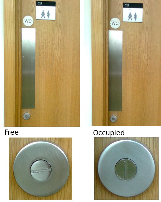
This one is sketchy. In the office we have several toilets with nice doors. There is no handle on the outside so it is obvious that the door needs to be pushed if someone needs to get in (there is a pulling handle on the inside). But what if the toilet (or restroom if you wish) is occupied. I often find myself pushing the door and wondering why the door does not open for a second or two. Then I realize that it is occupied and I have to wait. And when I’m on the other side of the door people push it to get in before realizing that it is occupied.
Looking more closely there is a difference between the locked and unlocked door. When the door is unlocked, the line on the locker is horizontal and when the door is locked the line is vertical. I’m not sure if this sign was put there intentionally or it just happened by accident. I’m voting for the later. And I’m hoping that whoever did this lock will further develop it and add some standard colour convention: E.g.: green circle when the toilet is not occupied and red one when it is. An even more advanced interface would be putting this coloured circle in the eye level because right now it’s in belt level.

