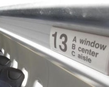
Aeroplane (bus or whatever vehicle) seat row signs can sometimes be problematic. This happens when a sign doesn’t picture the passenger in relation to the seat and the window. For example this one that assumes everyone speaks English:
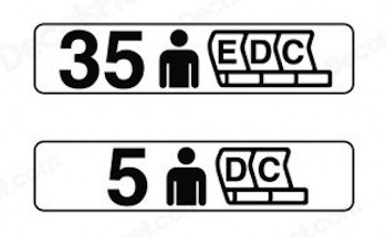
This one for example shows just the person. I’d assume that the person stands in the aisle and the nearest seat is E or D
This one shows the window only but I like its 3D perspective – very intuitive.
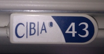
Here is one that shows both window and the person in the aisle. But NOT the seat letter??!?
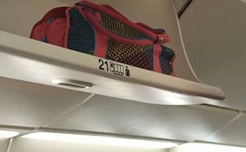
As it should like on the below example:
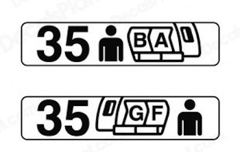
However my favourite is this one – very intuitive again!
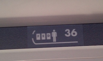

Σ(・△・)
Oh, well Sumiyo. What doesn’t kill you, makes you stronger.
Where can I get some cha candies? I should get a supply up to 2076.