Ok, I have to admit it. Finder is my file manager of choice. And I tried many. I used Norton commander on DOS, than Windows Commander (later changed its name to Total Commander) on Windows 3.1, then I switch to Windows Explorer on Win 95 because it used a better font (I didn’t like everything in bold in TC), I tried to switch back to Total Commander a year later but went back to Explorer, then I used midnight commander in Linux terminal, Nautilus on my desktop PC and Thunar on my laptop. I even tried some exotic ones like BumpTop, FSV and StepTree. Nowadays I use Finder and I like it a lot. I’m not sure if tabs would work for me (there is a huge fuss on the web to add tabs to Finder) in a file manager but I would give ’em a try (I use Nautilus on my desktop that has tabs but I never used them).

One function that I really like is the quick preview (pressing a space key brings up a quick preview of a file). But there are some things that annoy me:
- When I’m previewing images in a folder I select the first image, press the space key and then scroll down image by image with the down arrow key. It works fine if quick preview is not in full screen more. If it is in full screen then switching between images is not working anymore!!!
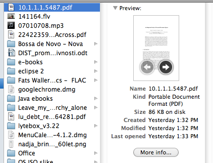
- When I’m previewing a pdf document (or doc) I often want to see all pages of it and quick preview one of them. Finder allows me to switch between pages clicking on left or right arrow on the thumbnail (see the image above). It takes me some clicking to get to the desired page (be aware that this is still in Finder) and when pressing a space the first page of that document shows up instead of one I’m looking at its thumbnail in Finder.
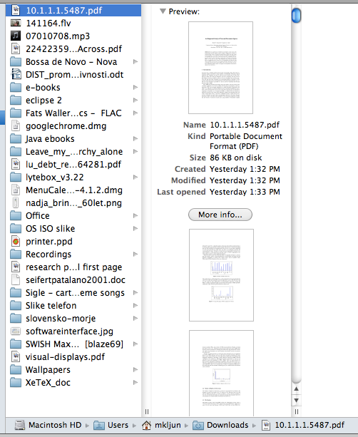
If Finder knows all thumbnails of a document, why is not showing them all at once like in the image below (which I made quickly). I would rather scroll all pages (and see more than one page at a time) than click on the thumbnail every time I want to switch page. And selecting one thumbnail page could preview it as well.

But I agree to what you are going to say – use the "real" Preview app. I use real Preview to do what I just described with documents. And I use Sequential to scroll images in full screen mode. But every one has their own ways of doing things. That’s what makes us unique. And nonetheless I would expect to be able to switch between quick previewed images in full screen mode as well and quick preview a page that I’m looking at in the thumbnail.
Edit 2. 6. 2011: I just realized that quick preview show what it is selected – this is the icon in a list of files (left side of the above image). Even if the thumbnail on the right is for example on the page 8, the icon thumbnail of the file on the left is still on the first page. And that is what quick preview shows.


now wasn’t there baby toy when I was little …
but of course it is all about standards, Standards, STANDARDS :-/
I’m not sure about the structural qualities of the different shapes (the bend at the end is hard!), but I’m sure do-able given will.
The problems always is not having a good idea of where things should be but the *path* from here to there.
Often the only time this can happen is when something new is introduced.
This happened when unleaded petrol was introduced. The green pumps have a slightly smaller nozzle than the old red 4 start pumps. This was because many cars using unleaded petrol also had catalytic converters which were spoiled by using leaded petrol (far more costly mistake than the petrol in a diesel engine, although some turbos can suffer). So as the green petrol pumps were *new* it was possible to standardise on a different diameter making it almost impossible to put leaded petrol in an unleaded engine … of course it was still quite possible to do it the other way round :-/
In electrics, there are regulations meaning that when you design a new connector for low-voltage equipment it has to be impossible to accidentally fit into any existing high-voltage plug.
Here, as in the petrol pumps, it is only the *new* entry that gets designed, you have to live with the older ones.
I’m aware of how old habits and things in use are hard to change (separate taps are one of them :)). But why introducing round nozzles with unleaded petrol? I still remember bigger red nozzles and bigger black nozzles for diesel. But in the last 15 years all old big nozzles were replaced with smaller ones even diesel nozzles for cars. So (almost) all nozzles were replaced.
I used to have an old Mercedes (it turned 31 last year when I sold it) with HUGE tank neck so I could use both big and small nozzles. I used to stop on pumps for trucks and fill my tank in less than a minute. I can’t use these truck pumps anymore with my new Fiat. The square diesel nozzle for example would still fit in my old Mercedes neck (it was big enough) and it would still fit in my new Fiat with diesel engine. But it wouldn’t fit in any petrol car.
Something similar happened to universal phone chargers. Main players had to sit down and decide to make things easier for users. But in this situation the “environment” was in question and as “environment” is a very popular term nowadays it wasn’t that hard.