Remote control units (RTU) tend to be complicated, over-covered with buttons that no one ever uses and coupled with a non-ergonomic shape!
Some argue that complicated designs were a long term tactic of media companies ;).
"… Maybe all of those legacy buttons that no one ever uses (the various
‘Picture in Picture’ controls and the colorful A,B,C interactive TV
buttons) are part of a deliberate design strategy? Maybe they are there
precisely to add to the cognitive load – the accumulated effect being
that valuable functions, like fast forwarding, are much harder to learn. …"
Good for the network companies which can now embrace DVR’s. No one will skip the commercials because it’s impossible to find the right button (or combination) for it.
I recently passed by a Radio Shark and saw this SupaLens Jumbo 8 in 1 RCU! Apparently you can beat complexity and ugliness with size. Or at least authors of it thought so. To my surprise, the net offers tons of such products.
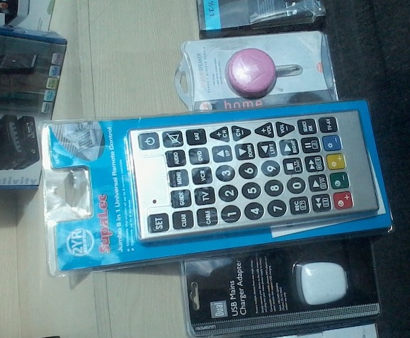
The good thing about it: IMPOSSIBLE TO LOSE! The product beside is a UK electricity plug which is HUGE (compared to EU or USA plug). So The Remote is little less tha 30 centimeters long and 15 wide. The target audience is older people. But does it really have to be this ugly? And complexity is still there! There was a good article about HCI for elderly in ACM INTERACTIONS a few years ago I cannot find. The RCU’s were one of the bad examples. Anyone remembers this article? I’d be glad to read it again.
However, not all RCU’s are badly designed. TiVo’s RCU for example has a nicely designed peanut shape with essential buttons on it (combined with the on-screen menus). Another one is activity based Harmony remote.