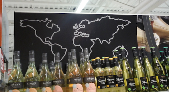
Here is a description and missing parts of the map:
- Italy is squeezed but the reason is a bold line used to sketch up the map
- both Malaysia and Indonesia are missing (the area bigger than UK or Ireland which are on the map)
- Japan’s not there even if its size is bigger then UK’s (377,944 compared to 243,610 km²)
- Greenland and Iceland are missing
- the islands in the Central America (Caribbean) are missing
- New Zealand is missing (and Tasmania as well)
The map raises several design related questions. What is the purpose of this map anyway. To communicate that the aisle contains international wines? Does it do a great job? Maybe the missing countries don’t produce wine. Well Japan does. And New Zealand does. Maybe the store does not sell wines from missing countries. What is the message of this map ….?!?

Hey Matjaž!
Actually this “natural” scrolling has been available since OS X Lion. The scrolling direction (meaning “usual” scrolling and “natural” scrolling”) can be changed in the System Preference in Mouse or Trackpad settings…
Hi Roland,
I know that it can be changed. But this is my own experiment about how long it will take me to adjust :). Now I’m using the “natural” way for five days and I’m still struggling.
I wonder if Apple did some experiments on this “natural scrolling” behaviour on trackpads. And I wonder why the installation does not automatically detect a laptop and select the “usual” for the user. Instead, based on the comments on the web, several people were surprised and all of my friends have already switched to the “usual”.
lp mk