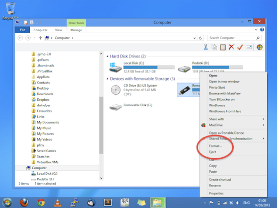
I found myself nearly formatting my thumb drive. If less careful and more in a hurry, I would just click all those "yes" and "OK" buttons. In the context menu of Windows Explorer (Windows 8), Format and Eject are grouped and even placed together. This is not the way to group functions together. Here are the reasons why:
- Ejecting is a common process while Formatting is used rarely (at least I use it rarely)
- Formatting can have a devastating consequences (deleted files)
- The only consequence of Ejecting if an ejected media

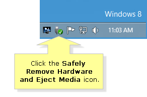
There are other ways to eject external storage in Windows (e.g. down by the clock in the right bottom corner as in Figure below) which do not have other functions beside. However, it is more intuitive for me to click on the actual thumb drive in Explorer as in Figure above.

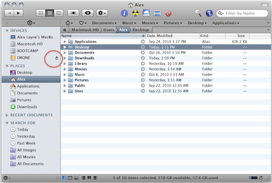
Now compare this to Finder in OS X

The button to eject an external hard drive is actually by the hard drive itself. And this is IMHO way more intuitive than some arbitrary position from which it is possible to eject several devices.
