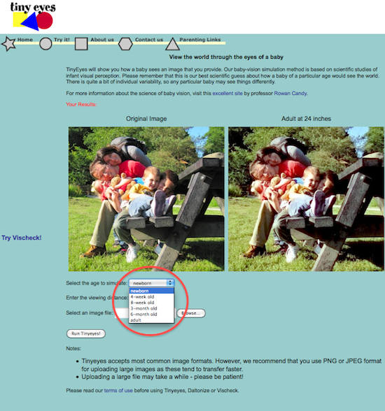
I came across this very interesting web site Tiny Eyes about the newborns’ vision. It lets you upload a photo and see how a new born, 4 weeks old child, 8 weeks, 3 months, 6 months old child and an adult see the world around at different distances.
However, I found it a bit over complicated. To see the same image for each of the available ages, I had to upload the same image again and again and select the desired age. I ended up uploading the same image 6 times for one distance only. I’m not sure about the decisions behind the interface but the only reasoning I thought of is that maybe showing more than one image at once is computationally too intensive and would take too much time. If this is not so, it would be better to:
- upload an image once and show all available ages and distances side by side.
OR
- upload an image and select the desired ages/distances by checkboxes so one, more or all ages/distances could be selected.