For the past month I’m stuck with Windows 8 as my MacBook pro had a common GPU problem which is being fixed at the moment (BTW I’m not an Apple fanboy and for the cost of their computers they should be way more reliable).
After a long time not using Windows (last time XP and then various flavours of Linux, BSD and OS X) I have found some annoyances with this particular 8th version. But the worst (being a PIM researcher) of them is Windows Explorer.
1. When navigating folders on the File Pane (right side), the tree in Navigation Pane (left side) is not expanding. So 8 levels down the hierarchy on a File Pane I realise that the tree is still closed and moving files between File and Navigation Pane is not possible until I move 8 levels down the hierarchy on both sides?!? I remember the expansion being default in Windows XP. I learnt so far that the current (non-expanding) behaviour became default in Windows 7 and is persistent in Windows 8. Who thought that this would be a good design? To make things just a bit worse they changed the way to turn automatic expansion on :(. (Windows 7 or Windows 8 solutions).
2. What are the Libraries for? It’s a rhetorical question. But I have all videos in separate folders (e.g. movies, cartoons, personal videos, etc.) and I don’t need the OS to accumulate them together. I put them in separate folders for a reason. The same with photos. So I’d love to remove Libraries from the Navigation Pane. Right mouse click in Navigation Pane and deselect "Show all folders"?!? What?!? What does this string has to do with Libraries?
And to answer my rhetorical question:
"In 7 it is intended that you use your Libraries to handle data, and leave the data management to the system"
Wait, what? I DON’T WANT THE SYSTEM TO HANDLE MY FILES! This is what all user studies suggest SINCE 1980! And nothing has changed in 2013 as far I as I read scientific papers :(.
3. Missing status bar. In XP the status bar showed the remaining space on the currently browsed hard drive or how big are selected files, how many of them are in the current folders, etc. I know this was not shown by default but View->Toolbars->Status bar (or something similar) was not hard to select. Now it’s gone … the reason:
"… removed due to a user anxiety problem, usually caused by reserved space allocations for the Virtual Memory or TEMP set asides …"
What, what, WHAT?
To clarify. I understand that less technically savvy users might embrace these features (I checked with my sisters and parents and they are not using the Libraries .. don’t even know what they are and what’s their use). But disabling features for Power users?!?! I simply don’t get it.
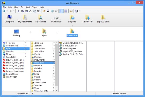
I’m also aware that there are alternative file browsers but I have to admit: I miss Finder and its Miller Columns which I personally find way more useful than trees.
The only two Windows file browsers with Miller Columns (or multi-columns if you like) I found are:
- UltraExplorer which sadly is not developed for the past 3 years and its multi column interface is very buggy (to name one, after deleting files the current column is not auto-updated and it crashes at least once a day)
- WinBrowser which isn’t cheap for a file browser but at least it’s being developed.

I find it hard to believe that there aren’t more alternatives.
Well .. every current OS has some annoyances and every new version of each of them will annoy some users. I suppose that’s life ….
EDIT 15. 5. 2013: WinBrowser is buggy :/. Crashes at least once a day. So no real Muller Columns alternative for Windows.

