In the previous post I talked about how I got to use the Windows laptop for a month. It is a whole another experience I must admit. The major difference (excluding the OS and software) is my screen size (being now a staggering 12.1 inches on my Lenovo ultraportable x61s).
I’m a big advocate of vertical tabs in UI. Almost all (if not all) desktop and laptop screens (excluding phones and tablets!) are growing horizontally. So the extra space on the side could easily be used for … you guessed it – TABS.
With 12 inches screen (1024×768) I had to reconsider the vertical vs. horizontal tabbing. I took a look at all major web browsers and opened 15 tabs (# of usually opened tabs) in each of them. The things to consider were:
1. How many tabs are visible at once (visibility is crucial for an overview of everything available)
2. How the tab UI helps as reminder to tasks to be done (people use all sorts of clues as reminders in all PIM tools – e.g. moving files to the desktop or un-marking email as read)
3. How tabs can be navigated (navigation has to be easy and improve both visibility and ‘remind-ability’)
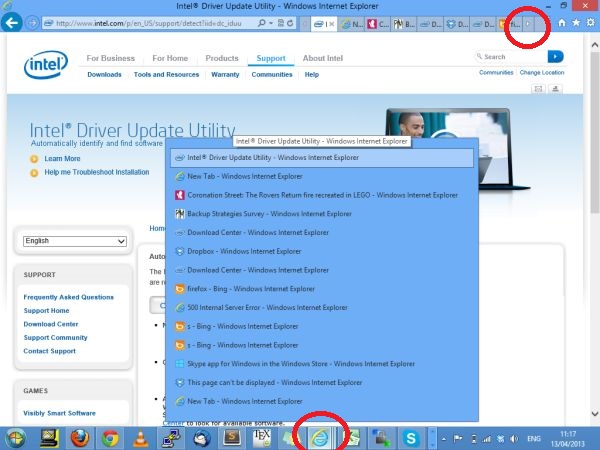
- Internet Explorer 10: IE can show only 8 tabs at once at this resolution. Tabs are hidden and reminding is greatly affected. Although a list of all tabs can be shown by clicking the IE icon on the Windows TaskBar. Navigating the tabs is tedious as well. The small chevrons/arrows on each side of the tab’s list are small. Vertical scroll with the mouse scroll button (the one that also moves left and right) is not working which makes the things worse. Tabs are also small and only one Letter of web page title is not helpful.
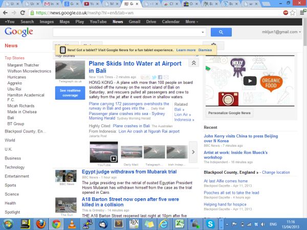
- Google Chrome: Tabs list is better as it spans over the whole browser’s window. In chrome all windows are visible all the time although they get squashed and don’t provide reminding capabilities. Beyond 20 tabs all the favicons disappear which makes the reminding, visibility and usability worse (see next image of the 30 tabs being opened). Maybe there’s an option to list them (Vertical tabs extension provides a list similar to the above in IE). Sadly Chrome does not support real vertical tabs anymore.
30 tabs opened in Chrome. No favicons are shown and there’s no way of telling what’s under each tab.
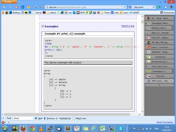
- Firefox + Tree Style Tab extension: Still my favorite, despite the small screen resolution that makes me sometimes scroll web content horizontally. But visibility, reminding function (favicons + page titles) and navigation are all there.
With vertical tabs, Firefox shows only 9 tabs at once at this resolution and navigating left and right on the tab’s list can be done by clicking on chevrons/arrows on both sides of the list (similar to IE). This can be tedious as the mouse pointer has to move from one side of the screen to the other. Horizontal scrolling with the mouse is not working. The spatial tab management is possible with Tab groups (which clearly helps visibility and navigation). But navigating from the tab’s list to the spatial tabs layout and back switches the context an Tab groups are not always visible while browsing.
- Safari: It shows 9 tabs only as Firefox, but the navigation on the list is done by pressing the 2 chevrons/arrows on the rightmost tab (why they are on the tab itself is not clear). The click on these arrows does not move the list left and right but rather opens a drop down list of remaining tabs (improving somehow the spatial memory). It also shows the list of all opened tabs by clicking on the icon in the TaskBar.
- Opera: is my second favorite and if it wouldn’t be for vertical tabs extension in Firefox this would be my choice. All opened tabs are visible at once (as with Chrome) and it is possible to group them (as with Firefox Tree Style Tabs or Tab Groups). Although the grouping somehow hinder visibility and reminding capabilities. Even if more tabs are opened the favicons remain visible (see next screenshot).
Opera with 30 tabs opened still preserves some visibility and reminding capabilities.
Although my screen estate is significantly smaller than the one on my 15.4 inches laptop, I still prefer vertical tabs. The reminding, visibility and navigation are still superior than with horizontal tabs and this outweighs some horizontal navigation on some web pages.


