1. I walked to this parking machine and started throwing money in without looking at it as the price was on the board beside it.
2. When I finished putting in £5 in change (15 coins) I realized that I had to put in the licence plate number first.
3. Because I don’t know my number I had to walk back to the car and memorize it on my way back.
4. I came back to the machine, put the number in, put the money in …. and pressed the wrong grey button (there are 39 grey buttons :)) ….
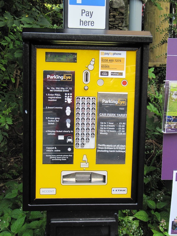
Why would they want people to put the licence plates numbers in? The first idea that crossed my mind was to prevent users to give one another the parking tickets. With the # on it it’s risky to do it. But this seemed stupid. My second thought was that whoever owns the parking place wants to be sure that each car pays the right amount and that there’s no cheating. And I was right. There’s a camera at the entrance. I’m not sure if it is directly connected to the parking machine. But they allow users to stay over the time they paid for. But before they leave they need to pay for additional time. The camera then records the exit time and the system knows if the car "owns" more money (probably sending the fine over mail).
I’m sure there are other ways of doing this. But let’s assume that the designers wanted the users to feel less restricted. There are no ramps and everyone is free to come an leave without restrictions. I’d believe that if there weren’t gazillions of signs "have you paid and displayed".
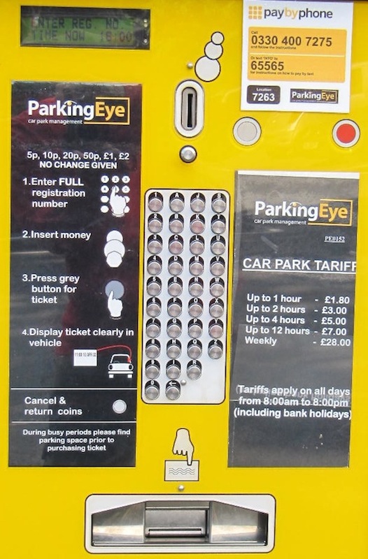
But let’s look at the interface itself which certainly has some flaws
– The machine does not allow different order of steps (e.g. money first).
– The keyboard has different layout than e.g. standard QUERTY which is known by a lot of people.
– The keyboard key labels are hard to see when standing by the machine because the buttons are covering the labels on the row below (I had to bend to see the labels and I’m only 174cm or 5.9).
– The grey button (see step 3 on the machine) should be of a different colour e.g. green to differentiate it from the rest
– The buttons should be labelled (I still don’t know what the red one is for as for cancelling the transaction one needs to press the grey button below the coins’ slot).
– There is no slot for banknotes and it’s hard to imagine that one has £28 in change for a weekly ticket. I barely scratched £5 myself. If I wouldn’t, I’d have to walk and spend cca. 15 minutes to get to the shop, change the money and return and pay. Of course there’s pay by phone, but I’m on pay as you go and I had less than £5 on.
I wonder if there were any logical designing decisions behind this design I can’t see any and so did not a few people paying right after me. They all complained.


For faster performance, probably worth just dropping down to text search for the link tag. I’d suggest the SAX streaming XML parser as this would then only parse until the link tag rather than the entire docuemnt, but not good for HTML. There does seem to be PEAR HTML SAX=like parser: XML_HTMLSax.
Alternatively could use embed.ly JSONP API. For some reason it failed for the stackoverflow example in your code, but worked with one of my menadeviation apegs and gave the correct favicon as ‘thumbnail url’:
http://embed.ly/docs/explore/oembed?url=http%3A%2F%2Fwww.meandeviation.com%2Fbooknotes%2F
I assume behind the scenes it will be parsing the page etc., although I’m sure caching the result.
BTW. if you use my client side js alongside your server-side script, you can make sure page renders with default icon even if the backend script takes a while.
Alan
Hi Alan … I edited the post live and you commented before I finished. I didn’t realize it :).
Good points. Thx … will have to try some other possibilities when I’ll get a chance.
Looking at the timings, there is lots of real elapsed time, but virtually no actual computation time, so it is not the parse time just the waiting for web access that takes time. Maybe switching curl for the separate get_headers and fopen would drop one http request, after that I’d AJAX-ify the script you have so that, while the first bit needs to be server side, the latency happens client-side and the last bit gets managed by img.onload event as I did in my simple js script.