I would really like to say the opposite but some big companies (on at least some of their projects) still don’t care much about usability tests. At least it seams so.
Take for example this USB dongle modem and its software. When I first plugged the modem in it took me about 40 minutes to upgrade the firmware even if the dongle was brand new from the mobile provider’s shop. Yes, I didn’t make a mistake – 40 minutes. It needed 5 firmware updates and upgrades. At the end I installed the modem software and I was done. The modem software is really simple and has only 4 stages which can be seen below on the 4 screen shots.
1. Disconnected stage (in this state the application is waiting for the user to click on Click to connect button): 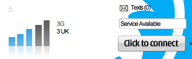
2. Connecting stage (while connecting a user can click on the Cancel button to cancel the connecting process):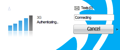
3. Connected stage (when connected a user can only disconnect by clicking on a Disconnect button):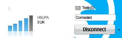
4. Disconnecting stage (when disconnecting a Disconnect button is still active and can be clicked): 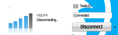
The fourth state has a problem. The disconnecting process takes around 15 seconds (sometimes even more). If during this process the Disconnect button is clicked again, it remembers the click and after disconnection it connects again. Note that only the text 3UK by the signal scale changes to Disconnecting … when changing from the 3rd to the 4th stage. The state of the modem field (Connected) stays the same and is really hard to see the change. Needless to say that at first I clicked the Disconnect button and after while the application went crazy. Disabling the button while disconnecting would solve the problem.
Note also how the text by the signal scale and above the button changes in 4 stages:
| 1st stage |
2nd stage |
3rd stage |
4th stage |
| 3UK | Authenticating | 3UK | Disconnecting |
| Service available | Connecting | Connected | Connected |
Why are Service available, Connecting, Authenticating, Connected and Disconnecting on different parts of the interface if they show the state of the modem is beyond my understanding.
- 1st state: Service of 3UK is available
- 2nd state: While connecting it has to authenticate (does the user need to know this information)
Changing Authenticating to 3UK would not hurt anyone as Authenticating is not really informative here - 3rd state: The modem is connected to 3UK network
- 4th state: While modem is connected it tries to disconnect (Italians would say: "Ma non mi dire …" isn’t this obvious)
Changing Disconnecting to 3UK and
Changing Connected to Disconnecting would provide more consistency to the interface.
This way the text by the signal scale would show just available mobile network and its type while the field above the button would show the state of the modem. If authentication would for example fail it would be nice to get the message in red in this field above the button (close to where the focus is when clicking it). A user would expect messages of the modem state to appear always in the same field and not on two as it is done now.
The answer to the title question: simple!