This doors can be found on (I think Pendolino) trains of a certain train operating company. They have nice big buttons which are nice to play with too (ask kids!).
One thing that bothers me is the distance between the warning button on the top saying "door locked" and "door unlocked" and the lock L button. The warning button is on the top because it has to be in the sight level to bee seen. The lock button is in my opinion too far away from it. They should be either together or even integrated on the top (in the sight level).
| |
I’m also not sure why the lock button has an L on it but it sure isn’t Braile. A lock icon would be a nice sign replacing L. The button for opening the door doesn’t have an O on it. So why don’t keep buttons consistent? Thinking of it, many designers don’t like metaphors because they argue that text is more informative. I prefer both; why not helping people with text and visual clues (like some computer applications that have icons and text under them in toolbars)? The lock icon could even change form unlocked to locked and vice versa, besides the text warnings "door locked" and "door unlocked".
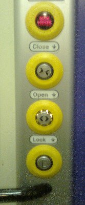
I like the arrows pointing to the buttons below them :)! What if these labels would be written on the buttons instead? On the yellow part for example.