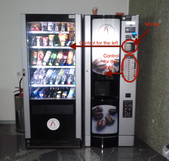
I wrote once about vending machines, their current interfaces and their (futuristic) designs. The worst interface is the ones in which items are distinguished by a random code. Well, this one is even worse.
The vending machine had no slot to put money in or a pad to select an item. I was puzzled for a bit. I looked on the left and right side, but nothing there.
Then I looked at the separate vending machine on the right and although it’s a coffee dedicated machine it had two pads: (1) the top one for the
machine on the left and (2) the bottom one for the machine on the right.
The money for both has to be inserted on the top pad. Weird and
confusing.