A few last posts were about me using my Windows laptop. The laptop I’m talking about is a lovely small 12.1 inch (1024×768 resolution) beast with a TFT display. Since resolution is not its strength, browsing the web often includes horizontal scrolling. To make things worse I prefer vertical tabs and thus making my horizontal screen estate even smaller. This hindered my browsing experience.
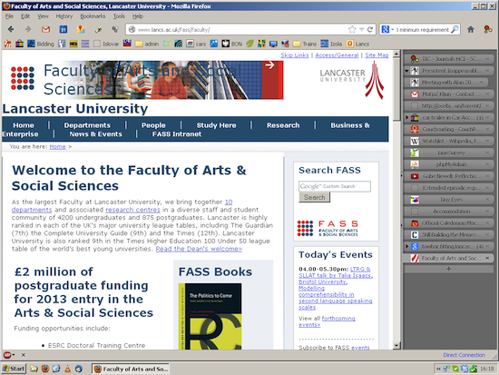
An example is a logo of this page on a wide screen:
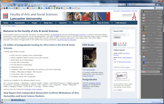
And the same logo on my 12 inch laptop:
A hot topic nowadays is a notion of W3C One web approach: "The recommendations … are intended to improve the experience of the Web on mobile devices. While my laptop is not a mobile device (well it can be also seen as such) my web browsing often resembled browsing the web on a large tablet.
There are 2 main approaches to the One web:
- Responsive web design: adapts the layout to the viewing environment by using fluid, proportion-based grids, flexible images, and CSS3 media queries. This means that a web site has one template for all devices and adapts the content rendering on the client side based on a screen size.
- Adaptive web design on the other hand determines the features of the end-user device and provides the content based on these features, usually using JavaScript. This means for example, that a retina screen will receive higher quality images then normal screen.
It is further divided in (from W3C): - Server Side adaptation implies that the content is delivered by the originating content server or application.
- In-Network adaptation is where the content is altered as it passes through one or more network components. Some network operators, for example, compress images before they are passed over the air to the mobile device.
- Client Side adaptation consists of the device accepting content and displaying it in an appropriate way for its characteristics.
I wonder how far away are we from the One Web Approach. Big companies
have already moved towards this goal (see BBC, Disney and others). But based on my experience, many small companies and organisations can’t afford to redesign their web pages. Especially if most of their revenue does not come from the web.
By some prophecies we’ll soon live in a mobile only world. I’m a bit sceptic about it. It is good to envision the future. But many such visions (although very interesting) often do not come true (see for example different visions of PIM). For one: such visions usually take into account a "developed world" only. Second: I think that we use different devices for different purposes and tasks. Some tasks are just not easy to perform on small screens or on-screen keyboard. And services should be tailored for this.