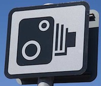
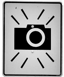
I still remember the anecdote of Adobe whose Photoshop did not sell well in Japan. Why not? Because their splash screen contained an eye which was offensive to Japanese. Today I drove down the road and I saw a speed camera sign (which UK is full of) and realized it is a symbol of an very old Brownie camera. It maybe does not even look like camera to today’s standards. And I was wondering what would such image mean to generations to come. Their cameras won’t look similar to the one on a photo (design sheets from DFT).
|
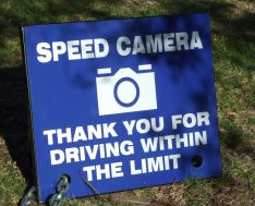
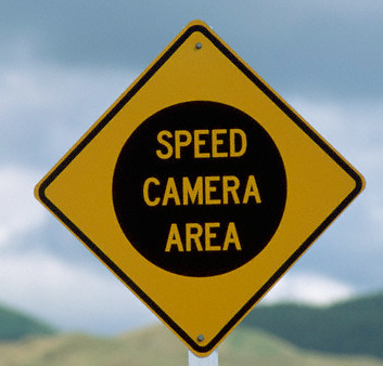
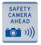
UK |
|||
|
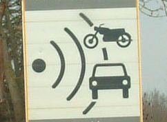
How do signs for traffic cameras (speed, red light, control) look around the world? Here’s how, and some designs are way better than UK’s: |
|||
|
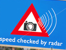
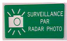
Some EU countries like France, Italy |
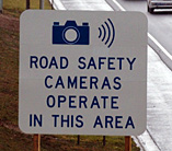
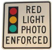
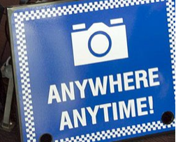
Somewhere in USA |
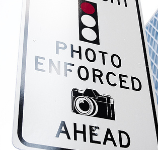
USA Seattle |
|
|
Australia |
Another one in Australia |
Singapore |
|
|
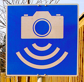
Norway |
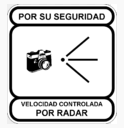
Spain |
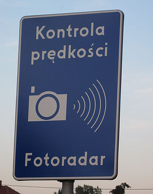
Poland |
|
|
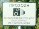
Greece (a lot of British tourists down there) |
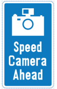
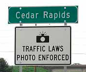
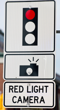
USA – Iowa |
||
|
USA – warning of a cam with no cam |
USA – Seattle |
">
USA – California |
|
|
USA Washington Bellevue |
New Zealand (no cam) |
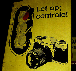
Netherlands |
|
|
Netherlands |
Australia, Perth |
||
|
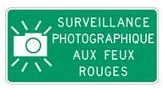
Canada, Quebec |
Australia, Sydney |
||
|
Canada Winnipeg |
Australia |
||
|
USA, Connecticut.png |
|||
|
Canada, Quebec |
|||

Which one do you like most?