Scrollbars are interesting interaction widgets. They seam so obvious, we don’t even notice them. But how did they develop? Watching the new OS X Lion and Ubuntu Unity changes in scrollbars, I remembered two interesting articles about how scrollbars moved from left to right side of the screen and why is the right side not such a good idea ("Hands across the screen" and "Sinister Scrollbar in the Xerox Star Xplained"). The idea is that eyes have to move from the text one is reading on the left side of a screen, to the scrollbar on the right and back, which requires a lot of unnecessary eye movement.
Let’s take a quick look at the evolution of scrollbars:
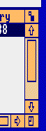
1. Scrollbars on the right side in SmallTalk and InterList environments (early history of these systems):
|
|
1980 Smalltalk From "Hands across the screen": "The early scrollbars in the Smalltalk and Interlisp environments (the |
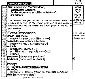
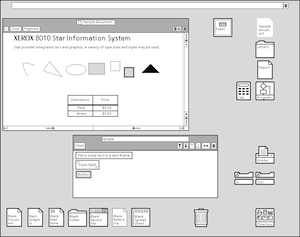
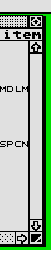
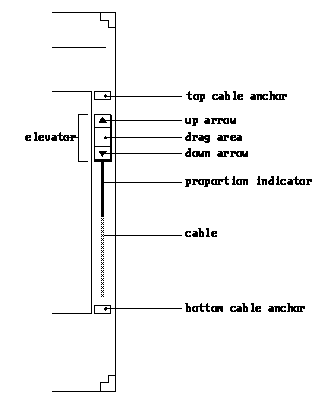
2. Moving scrollbars to the right in Xerox Star
 |
1981 From "Hands across the screen": "The movement of the scrollbar to the right "Looking at the Star scrollbar (left and right), it has three types of control:
The arrow and page up/down buttons are similar to current scrollbar |
 was not an accident, but a
3. Remaining on the right …
… in Macintosh OSes, Sun Open Look, RISC OS, OS2, Windows, BeOS, KDE, Gnome … and also turned arrows in opposite direction. The size of a drag area also started to vary in size depending how much content there is in the window.
From "Hands across the screen": "As the Star evolved into the current Macintosh, Windows and X
environments, the design changed to the current dragging form where the
‘handle’ is grasped by the mouse and moved to an arbitrary point in the
document. The design changed, but the rationale for placement was not
revisited leading to the current, unsatisfactory situation.
Another bit of design rationale that got lost in this transition was the
direction of the arrows on the scrollbar. On most current scrollbars
the line-by-line arrows point outwards whereas the Star arrows pointed
inwards. In both cases pressing the upper arrow makes the window move
upwards in the text (and hence also the scrollbar handle upwards).
Recall, there is no obvious ‘right’ answer for this. If the arrows
point outwards they match the movement of the handle, but the text moves
in the opposite direction (as you move up the document the text moves
down). If instead, the arrows point inwards they match the movement of
the text on the screen, but oppose the movement of the handle (the
downwards arrow moves you upwards in the document)."
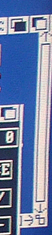
3.1 Macintosh OSes
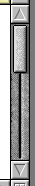
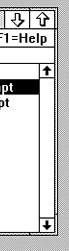
Notice omitting the top and bottom pages from Lisa to OS 1 and moving top arrow to the bottom from System8 to System 9. The latter change makes sense since it brings the arrow buttons close, so one could move up and down the text without moving a mouse up and down the screen. The grouping of arrows was used before in AmigaOS2, BeOS, Next and SunOS terminal (until v4 I think). In System 7, the scrollbar was omitted if not needed to get some more screen estate and not to confuse users with a nonfunctional scrollbar.
| 1983 |
1984 |
1988 |
1991 & 1997 |
1999 |
2001 |
 |
 |
 |
 |
 |
 |
| Apple Lisa |
Mac OS 1 |
System 6 |
System 7 & 8 |
System 9 |
OS X |
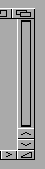
3.2 Microsoft Windows.
Not much has changed here. The scrollbar was omitted if not needed in Windows 95 (I think, but not quite sure).
| 1985 |
1987 |
1990 |
1995 & 2000 |
2001 |
2007-2011 |
 |
 |
 |
 |
 |

|
| Windows 1 |
Windows 2 |
Windows 3.0 3.1 |
Windows 95 Windows 98 Windows 2000 |
XP & Me |
Vista & 7 |
3.3 Other OSes
Open Look had arrows integrated with the slider (something similar was rediscovered years later). The scrollbar could be moved to the left. Open Look and Rics OS had a middle line resembling analogue sliding buttons with Open Look also showing the darker grey line for revealing the amount of context. BeOS had both arrows on the top and on the bottom (similar to the below SunOS Terminal – see point 4.) while Haiku (a version of BeOS) omitted them and used "most standard version". Amiga gadtool scrollbar resembled the Next’s scrollbar but was positioned on the right. Risc OS used mouse buttons to manipulate the thumb movement (similar to Athena scrollbar).
| 1987 |
1988 |
1987 |
1991 |
2004 – today |
1988 – 2002 |
1988 |
1989 – today |
|
 |
 |
 |
 |
 |
Right side |
Left Side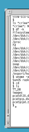 |
 |
 |
| Acorn – very similar to Apple OSes |
GEM OS for Atari ST |
AmigaOS Workbench 1 |
AmigaOS 2 with gadtool widget set |
AmigaOS 4 (the first prerelease) |
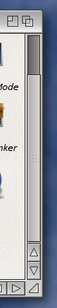
Sun Later Sun dropped it for CDE & Gnome in 2002 * |
Risc OS Manipulation with mouse buttons clicks |
Motif Widgets Motif WM
as a Open Look competitor By OSF copied MS Windows and OS2 Presentation mngr |
|
| 1988 |
1992 |
1994 |
1996 |
1993-Today |
1998 |
Today |
 |
 |
 |
 |
 |
 |
 |
| OS2 1.1 Presentation Manager UI |
OS2 2 |
OS2 3 |
OS2 4 |
Unix CDE
based on Motif |
BeOS |
Haiku
|
4. On the left side
It is interesting that NextStep was bought by Apple and they did not
think that the left side was the right one. Plain Emacs and Ghostview
have scrollbars on the left (if I’m correct the latter uses
Athena Widgets). So do some terminal emulators such us xterm, rxvt, etc (which use Athena widgets or some of Xaw’s forks). Some applications allow to move a scrollbar to the right side as well. But it depends on the application and widget
library it uses. AFAIK Gnome (GTK+ widget set) and KDE (Qt widget set) don’t have an option for the scrollbar side. Neither do Windows and OS X. Although web text forms can have a left sided scrollbar. PALM has an addon to do this. Other than that …
| 1988 |
1988 – 2002 |
1989 – 2006 |
Today |
1983-Today |
1983-Today |
|
 |
Right side |
Left Side |
 |
 |
 |
 |
|
Terminal of |
Sun Later Sun dropped it |
NeXT NextStep & Sun Openstep & Lubu Open Magic 2006 |
Emacs |
Ghostview |
rxvt in CTWM 1983 – the 1st |
|
5. Potable devices and scrollbars on the right side
On portable and touch screen devices, the scrollbar on the right side makes sense as otherwise one would cover the screen while scrolling the text. They have a minimalistic touch where Arrows are mostly omitted – mostly because of the precious screen estate and other means of navigation (keypad buttons) where scrollbar is used for informing the position. iOS scrollbars come visible when we move the pointer over the right edge of the window. This is so called overlay scrollbar.
| |
|
||
 |
 |
 |
 |
| Android v1 | Symbian 40 |
Symbian 60 |
iOS |
6. Overlay scrollbars …
… are the next thing on the desktop as well. OS X Lion will have them and Ubuntu Unity as well. One can argue whether this is good or not. For portable devices it makes sense since the screen is freed by a few pixels on the right side. But for desktop computers and laptops with wide screens, the gain is not obvious. Although, in a full screen mode we would have less distracting elements.
| 2011 |
2011 |
 |
 |
| OS X Lion |
Ubuntu Unity |
Canonical has made a video about their overly scrollbar implementation.
Some DESIGN decisions and manipulations EXPLAINED
I already explained some of the design principles. Here are more detailed explanations.
|
OPEN LOOK scrollbars (left) use the visual
Also similarly to Athena scrollbar, Risc OS allowed manipulating scrollbar arrows with pressing mouse buttons. For instance, a left-click on the down arrow might cause |
An Athena scrollbar looks and operates differently than a scrollbar provided by a Motif or Macintosh. While Motif and Mac scrollbars have separate parts to invoke different types of scrolling, the Athena scrollbar moves text according to which mouse pointer button you use and how you use it.
Like the Athena Scrollbar widget, the Motif scrollbar has a “thumb” or |
I’d really like to know the background of other scrollbars design of the above mentioned systems. If anyone knows something about this issue I’d be glad to include it in this post. I might have also missed some important changes or made mistakes – so please let me know if you see, spot or know something more about scrollbars.
——————————–
Videos linked to in this post:
Canonical’s overly scrollbars
Arrows in the scroller (like Sun Open Look)
Overlay Scrollbars in Unity – implementation from Canonical Design on Vimeo.