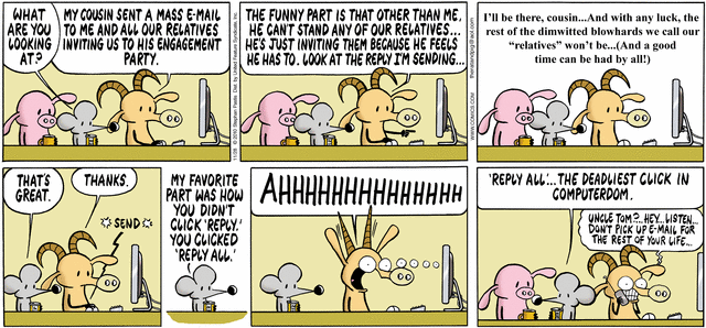
It happened a few times that I replied to the whole mailing list instead to sender only. Hopefully I didn’t reveal any secret information or offend someone. The Goat unfortunately did not pay attention and his click on Reply All had unpleasant consequence.
How could these buttons be designed to prevent such mistakes?
Let’s look at some on the most common interfaces:
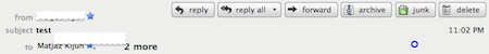
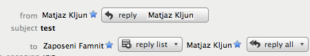
- Thunderbird figures if the email was sent to one or more people and even if the email was sent to the mailing list. The buttons are positioned one by one and have different icons on them. There is even a possibility to have all three together if an email was sent to more mailing lists or a mailing list and one or more individuals. Buttons are a part of the email and From and To fields are close to buttons which allows user to see the context of the email while selecting appropriate buttons. Reply All and Reply list have also a drop down menu while Reply does not.
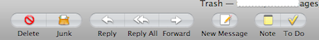
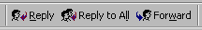
- Apple Mail has buttons separated from email. As such email details are far away from buttons which are positioned on the top toolbar. As with TB, buttons are close together and have different icons on them: one left pointed arrow form Reply, two left pointed arrows for Reply All and a right pointed arrow for Forwarding.
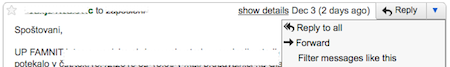
- Gmail has also incorporated possible actions to email (like TB). It prevents users to accidentally click on Reply All as it is hidden in a drop down menu. It can be accessed only by clicking on the arrow by Reply button.
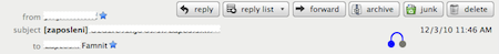
- Outlook 2003 interface is similar to that of Apple Mail. Buttons are separated from the email context and positioned on the top toolbar. As with the rest of examples, the Reply icons have a left pointed arrow while the forward button has a right pointed arrow. It distinguishes them by # of faces. The Reply All button has two faces instead of one.
There is certainly the trade off between showing all buttons as the interface allows it and hiding all less accessed buttons so the user is less likely to make a mistake. What is the best option? I like how TB knows that the email was sent to the mailing list (probably just by finding the [.*]). And I kind of like Gmail’s drop down menu for security although I prefer all buttons visible. I definitely like the buttons to be incorporated with the email and I would like them to be incorporated in the email context even more! Like this for example:
Including the name of the person on the button and put buttons by the possible recipients’ emails.

You know it from your phone: tell a name, and I’ll call that person for you. Example: I speak to the phone “mum” and it calls dad :). Joke aside, voice recognition on the phones never worked for me. But apparently the Windows 7 voice recognition
In the last few posts we have shown videos of possible PIM of the future: Apple’s personal assistant from 1987 about life in 2011 Sun’s Starfire concept from 1994 about life in 2004 and Virtual reality PIM from 2002 In 2009 Microsoft publishe