Scroll bars are one of those widgets that many think are plain simple to design but they went though many changes and design decisions over the years. However, users can easily get frustrated if scroll bars are not designed right. I’m not the first or the last one and Alan has many examples:
- a web page scroll bar (possibly a JavaScript) under a web browser’s window scroll bar
- infinite scrolling and different behaviour on different devices and
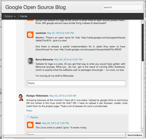
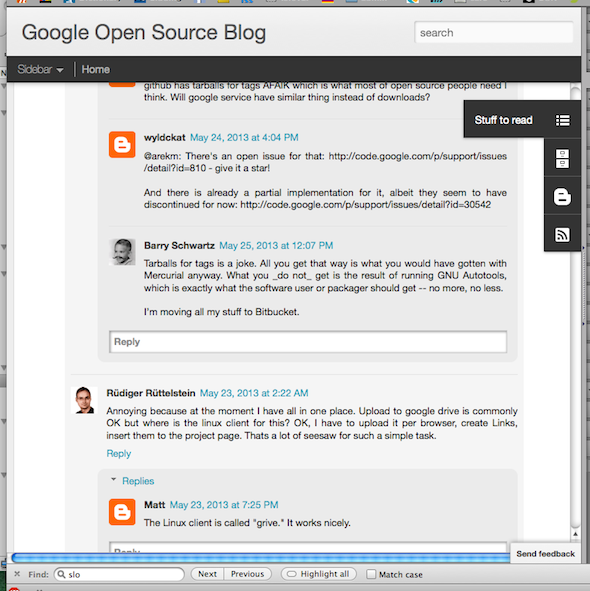
- hidden scroll handle under other widgets on the web page.
I just found an example of the latter myself on the Google Open Source blog. Apparently this is a Blogger ‘s feature and I wonder if people (after years of) writing on Blogger even came across this problem. And if responsible at Blogger thought that the scroll bar would be obscured by positioning things on the right side of the web page. Based on other blogs on Blogger this can be turned off.


